Screen printing: how to prepare your file for crisp, clean prints
Screen printing: how to prepare your file for crisp, clean prints
Screen printing is one of the oldest commercial printing techniques and still the gold standard for high-volume apparel and merch work. Each color is printed through a separate stencil (the "screen"), one at a time, with precise registration. Done right, the results are sharper and more durable than almost any digital alternative.
Done wrong — with poorly prepared files — you get color misalignment, lost detail, broken edges, and reprints. Here's exactly how to prepare your file so the screen printer can produce the print you actually want.
How screen printing shapes the file workflow
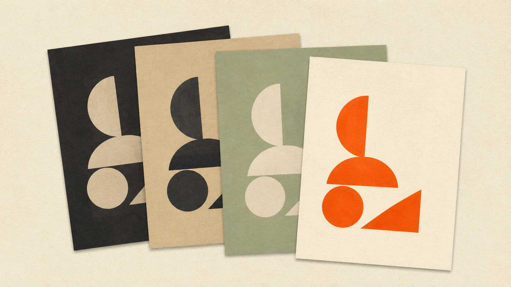
The defining feature of screen printing is color separation. Every color in your design needs its own screen, and each screen prints one color of ink at a time. A two-color logo needs two screens. A four-color design needs four screens. And so on.
This means your file has to be structured so the printer can separate each color into its own layer for screen creation. A flattened image where all colors are merged together can't be screen-printed without manual rebuilding.
What this means in practice:
- Vector files are strongly preferred because each color is naturally on its own path
- Layered Photoshop files can work if colors are clearly separated on layers
- Flat JPGs or PNGs require the printer to manually trace and separate each color, which costs you time and money
File requirements that matter
Vector source whenever possible. Adobe Illustrator (.ai) or Encapsulated PostScript (.eps) are the screen printer's preferred formats. They allow each color to be selected, isolated, and output to a separate film positive.
If you only have a raster file, convert to vector before submitting. ArtworkUpgrade handles this — upload your JPG or PNG, see a free preview, download SVG, PDF, EPS, AI, or DXF. The vector output preserves color regions cleanly so each one becomes a separate screen.
Spot colors specified, not process colors. Screen printing usually uses spot inks — pre-mixed colors based on Pantone numbers. "Pantone 186 C red" is a spot color spec. "CMYK 5/95/85/22" is process color, which screen printing can do but doesn't love.
Spec your colors by Pantone number when you can. The printer mixes the exact ink, not a CMYK approximation.
Solid colors, no gradients. Traditional screen printing can't reproduce gradients smoothly. Some modern screen techniques (halftone screens, simulated process printing) can approximate gradients, but they require specialist setup and add cost.
If your design has gradients and you want screen printing, either simplify to solid color regions or accept that the print will look different from the screen design.
Text outlined to paths. Live fonts can substitute between machines. Outlined text is locked in. Convert all text in your file before sending.
Minimum line weight respected. Screen-printed lines below about 1 point at print size don't hold up — the screen can't reliably reproduce the detail. Beef up any hairlines in your design.
Resolution: 300 DPI minimum for any raster components. If your design includes any rastered elements (a photographic background, a textured fill), those need to be at print resolution. A 1,000-pixel photo blown up to 12 inches will look soft on the shirt.
This is the same root cause as logos looking blurry when printed on t-shirts — files designed for screen, asked to print at size.
The white underbase for dark garments
When printing on dark fabric, screen printers usually lay down a white underbase first, then print the colored inks on top of that white layer. Without the underbase, colored inks soak into dark fabric and look muddy.
What this means for your file:
- The printer needs to know which areas of your design will get the white underbase
- Most file workflows handle this automatically (the white underbase mirrors the printed areas)
- You don't usually need to design the white underbase yourself, but understand that any white areas in your design will print as white ink (not transparent)
Color separation as a paid service
If you send a raster file, the screen printer typically charges a separation fee — manually rebuilding your design into separate color layers in Photoshop or Illustrator. Fees usually run $25 to $150 depending on complexity.
If you send a clean vector file with each color on its own path, separation is automatic and usually free.
The math is simple: hand the printer a clean vector and you save the separation fee. Hand them a raster and you pay for the work upfront or wait while they redo your design.
Common screen printing file failures
Failure 1: Misregistered colors.
If your file has overlapping color regions and the printer's registration is off, you see gaps or doubled lines where colors meet. The fix is "trapping" — slightly overlapping adjacent colors in the file so registration variation doesn't show. Most professional screen printers handle this in their prepress, but knowing it exists helps you understand why edges sometimes look slightly off.
Failure 2: Too many colors for the budget.
Each color adds a screen, a setup, and machine time. A four-color design costs significantly more than a two-color design. If you have a complex multi-color logo and a tight budget, simplify before submitting. Most logos can be cleaned up to 2-4 colors without losing identity.
Failure 3: Thin lines breaking up.
Screens can only reproduce so much detail. Lines or text below 1 point break up or disappear during printing. Always check minimum stroke widths before sending.
Failure 4: Customer-supplied screenshots.
Same issue as print shops handling bad customer files. A screenshot at screen resolution becomes a soft, pixelated print at apparel size. Either ask for a better file or charge for the conversion.
Failure 5: Mixing process and spot colors without specification.
If your file uses both spot Pantone colors and CMYK process colors, the printer needs to know which goes on which screen. Without specification, they might convert everything to process or to spot — neither of which may be what you wanted.
Submitting files to a screen printer
A clean submission package typically includes:
- The artwork itself as a vector file (AI or EPS preferred)
- A flattened preview (PDF or JPG) showing how the final should look
- A spec sheet listing: shirt color, ink colors (Pantone numbers), print location, print size, quantity, sizes
If you want the printer to color-match an existing piece (a previous order, a sample shirt), include a physical sample or a photo with detailed notes.
For Indian apparel printing operations, Kraftix Digital runs screen printing alongside DTF, embroidery, and packaging printing across India.
Single-color vs multi-color cost economics
Quick numbers (typical US/Indian market ranges, vary by region and shop):
- Single-color print on 50 shirts: roughly $4 to $7 per shirt (screen + setup + printing)
- Two-color print on 50 shirts: roughly $5 to $9 per shirt
- Four-color print on 50 shirts: roughly $7 to $12 per shirt
Each additional color adds setup cost and per-piece cost. For small runs, simpler designs are dramatically cheaper. For large runs (500+ pieces), the per-color cost gets amortized down and color count matters less.
Designing within budget often means simplifying the color palette of an existing design. A logo with 8 colors might be redesigned for screen printing as a 3-color version that captures the identity at a fraction of the cost.
Related apparel decoration
Screen printing is one option in a broader apparel decoration toolkit. For longer runs and detailed designs, DTF printing competes directly. For one-offs and complex multicolor designs, DTF often wins. For long runs of simple designs, screen printing's per-piece cost is unbeatable.
For decoration involving stitching, the workflow shifts to embroidery file preparation, which has its own rules.
Halftones for photographic effects
Traditional screen printing is solid colors only. But screen printers can simulate gradients and photographic effects using halftones — patterns of small dots that visually blend into apparent shades.
Halftone basics: Instead of printing a solid 50% gray, the screen printer uses a screen with small dots that cover 50% of the area. From a normal viewing distance, the dots blur into a gray tone.
LPI (lines per inch) controls dot size: Higher LPI = smaller dots = finer detail, but harder to reproduce. Apparel screen printing typically uses 35 to 65 LPI. Fine paper printing uses 150+ LPI. The mesh of the screen sets the upper limit.
File preparation for halftones: Photoshop converts grayscale images to halftones via Image > Mode > Bitmap > Halftone Screen. You set angle, frequency (LPI), and dot shape. The output is a 1-bit file the screen printer can burn into a screen.
When halftones make sense: Photographs reproduced as single-color screen prints (a portrait, a landscape) work well as halftones. So do designs with implied shading or volume.
When halftones don't work: Very small designs (the dots become visible noise), very intricate detail (the dots blend together), or design elements that need crisp solid edges.
Simulated process for full-color photographic prints
For photo-realistic full-color screen prints, "simulated process" printing uses 4 to 12 separate screens of carefully chosen colors that overlap to reproduce a photographic image on fabric.
This is a specialist technique requiring an experienced separator, specific ink choices, and tight registration. The result can be stunning — full-color photographic prints on dark t-shirts that look like high-end concert merch. The cost is higher than basic screen printing and the file preparation is more complex.
Few shops handle simulated process well. If you need photo-realistic screen prints, find a specialist rather than asking a general shop to attempt it.
Tracking artwork across orders for repeat clients
Screen printing shops working with repeat clients (sports teams, schools, corporate uniforms) benefit from systematic artwork tracking. The same logo gets printed dozens of times across years.
Save approved files with clear naming. "ClientName_Logo_2-color_2025.ai" is searchable. "logo final v3.ai" is not.
Document ink colors used. When the client orders 30 more shirts a year later, you want to match the originals exactly. Pantone numbers in your file metadata or order notes prevent guessing.
Note any setup quirks. "This logo requires extra trapping on the red/black border" is the kind of institutional knowledge that lives in a senior printer's head and gets lost when they're not available.
Preserve the screens for repeat runs. If you reclaim screens after every job, you re-burn for every reorder. If you preserve screens for repeat clients, you save setup time on every reorder. A simple physical labeling system saves real money over years.
For shops doing high volumes of repeat work, treating artwork as a long-lived asset (rather than a per-job file) pays back substantially over time.
Storing screens and reusing files
Screens are physical objects with real storage costs. Small shops typically reclaim screens after each job — strip the emulsion, prep for the next design. Larger shops with steady repeat orders sometimes keep screens for top customers.
This matters for file storage because the customer's vector file is the master source. If a customer reorders next year and you reclaimed the screen, the file is what you re-burn from. A lost file means re-prepping art, re-charging setup, and a friction-filled reorder conversation.
For each screen printed job, archive:
- The customer-approved final art file (vector, color-separated)
- A printed proof or photo of the actual print
- Color match notes (Pantone numbers, ink brand and code)
- Screen mesh count and emulsion type used
- Any special handling notes (registration tricks, off-contact adjustments)
When the customer comes back wanting "the same as last time," you produce the same shirt with no re-prep. This is also how you earn customer loyalty in print — frictionless reorders.
What to do if your file fails the shop's prepress check
Prepress is the first quality gate on a screen printing job. If your file fails it, the shop will email you back and the job pauses. Common reasons and quick fixes:
Resolution too low. They wanted vector or 300 DPI raster, you sent 72 DPI web art. Find a higher-resolution version or convert your existing raster to vector for a cleaner result.
Colors not separated. Multi-color designs need each color on its own layer or as named spot colors. Reopen in vector software and assign spot colors.
Text not outlined. Send the file with type converted to paths so the shop doesn't need your font.
Embedded raster inside the vector. A vector file that includes a JPG inside it still has the JPG's resolution limits. Replace embedded raster with vector traces.
File too large for email. A common cause of confusion. Use Dropbox, Google Drive, or WeTransfer. Some shops have artwork upload portals.
For most prepress failures, fixing the source file once prevents the same problem on every future order. The first fix is the only fix.
The takeaway
Screen printing rewards clean vector files with separated color layers. The fewer colors and the cleaner the source, the cheaper and crisper the print. If you only have a raster file, convert to vector first to save the separation fee. Spec your colors by Pantone number, outline your text, watch your minimum line weights. The print method is one of the most durable available — but it only delivers when the file is right.
Stop redrawing customer logos by hand
ArtworkUpgrade vectorizes any logo or design in 30 seconds. Free preview before you pay. $7 per design, all formats included.
Try free preview →More guides for Industry Guides
Cricut SVG vs DXF: which file format to use when cutting
SVG and DXF both work in Cricut Design Space but they're not interchangeable. Here's when to use each, the trade-offs, and how to convert from a raster.
How to vectorize a logo for embroidery: a practical guide
Embroidery digitizing software needs clean vector input. Here's how to get a logo embroidery-ready, what to do with bad customer files, and common failures.
Sublimation file format guide for crafters and small print shops
Sublimation is file-fussy and unforgiving. Here's the resolution, color mode, transparency, mirroring, and substrate rules your file needs to follow.