How to prepare a logo for screen printing: the customer guide
How to prepare a logo for screen printing
Screen printers reject more files than any other type of print shop. The reasons are specific and the fixes are knowable. If you're sending logos to a screen printer for apparel, signage, or product printing, here's exactly how to prepare files that don't come back with prepress questions.
What screen printing needs from your file
Screen printing puts ink through a screen onto a substrate. Each color in your design needs its own screen. The file you send has to support that workflow.
The minimum requirements:
- Vector file in AI, EPS, vector PDF, or SVG
- Separated colors (each color on its own layer or as named spot colors)
- All text outlined (converted to paths, not editable type)
- Pantone or specific color references for any brand-critical hues
- Reasonable color count (1-6 colors typical; more is possible but expensive)
- Realistic line weights (nothing thinner than 0.5pt for dark on light, 1pt for white on dark)
If your file doesn't meet these, the printer's prepress team has to fix it — and they'll charge you for the work or push back on the order. Better to send it right the first time.
For the full screen printing file requirements, the shop-side workflow covers what prepress is actually doing. This guide is the customer-side prep that makes their work clean.
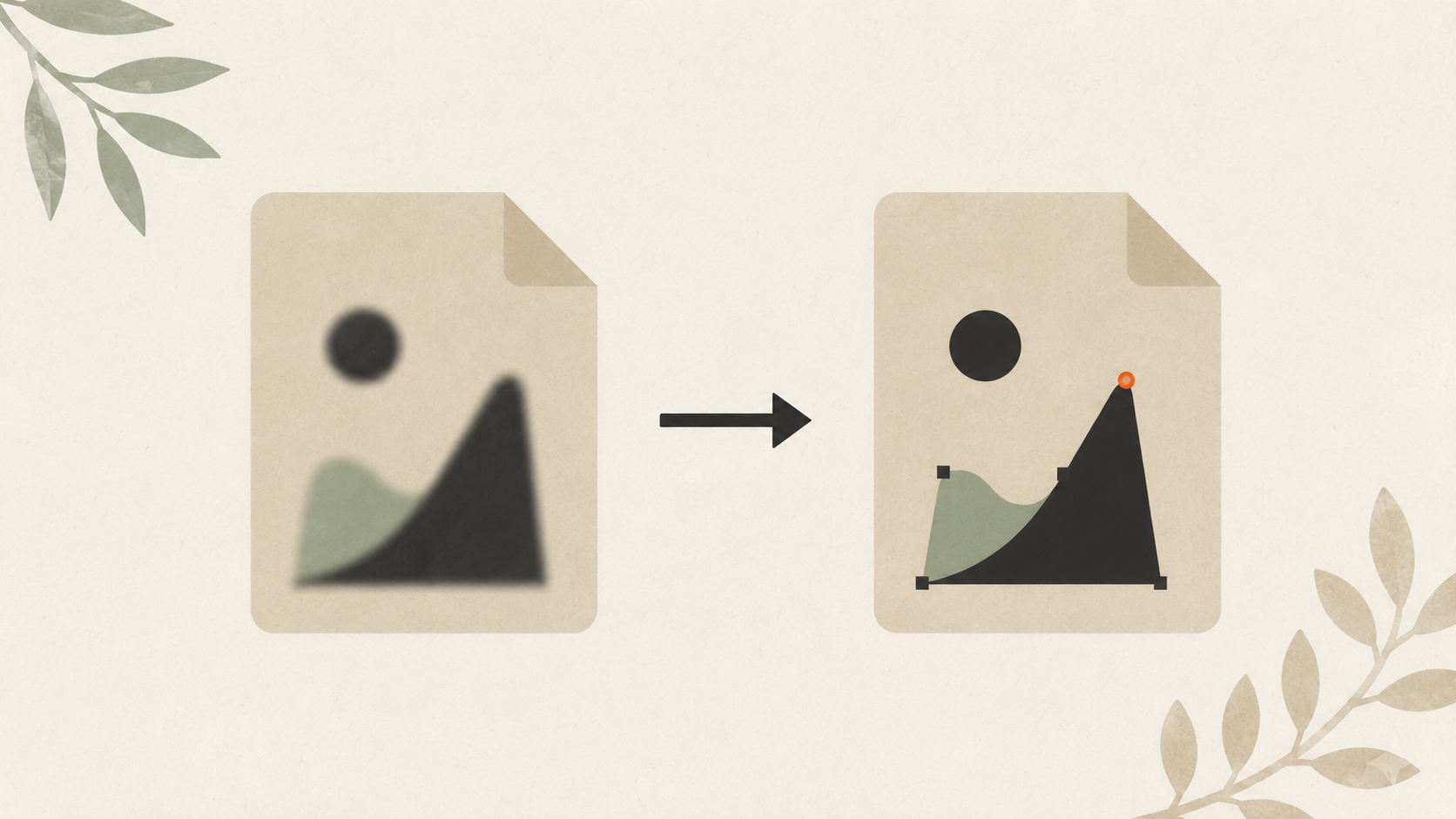
Step 1: Get a vector file
If you don't already have a vector logo, the first step is converting whatever you have. Screen printing essentially requires vector — raster files cause separation problems, color noise, and prepress rework on every job.
The full workflow for converting a JPG or PNG logo to vector covers methods in detail:
- AI vectorization tools — fastest, affordable. ArtworkUpgrade handles this in one step with SVG, PDF, EPS, AI, and DXF outputs. Preview before paying.
- Manual tracing in Illustrator or Inkscape — free or low-cost, requires design skills.
- Hire a designer — best quality, highest cost.
For most small businesses, AI vectorization is the practical choice. The conversion lasts you forever — once you have vector files, every future screen printing job (and embroidery, sign, vinyl) goes smoother.
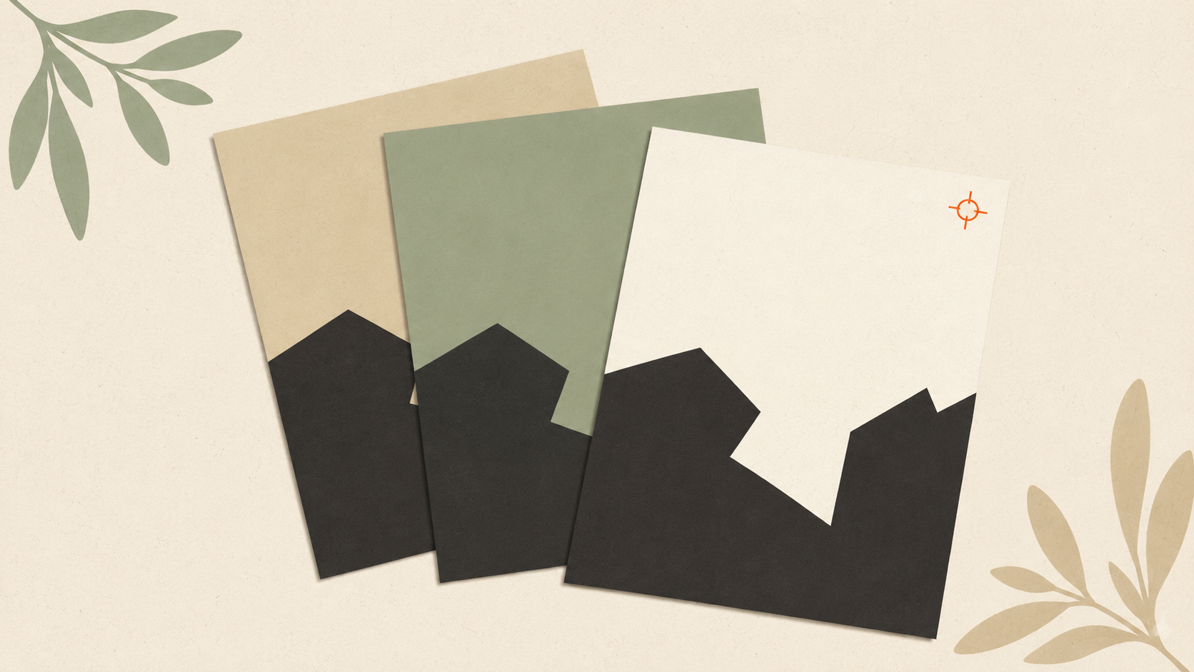
Step 2: Separate the colors
Each color in your design needs to be a distinct, identifiable element in the file. The screen printer pulls each color into its own screen for printing.
In Illustrator:
- Open your vector file. Select an element.
- Use the Eyedropper or look at the Color panel to see the current fill.
- Open the Swatches panel. Note which colors are in use.
- For each color in your design, assign a Spot Color swatch (Window → Swatches → New Swatch → Color Type: Spot Color).
- Apply the spot color swatch to all elements of that color.
- Repeat for each color in your design.
In Inkscape:
- Open your vector file. Open the Layers panel (Layer → Layers).
- Create a layer for each color in your design.
- Move elements onto their corresponding color layer.
- Save the file as SVG (which preserves layer information).
Why this matters:
If your file has six elements but they're all using CMYK-mixed colors instead of named swatches, the screen printer has to manually identify which elements go on which screen. With proper separation, the file is ready to burn screens directly.
Step 3: Outline all text
If your design includes text, convert it to paths before sending. This prevents two problems:
- The printer not having your font (and substituting a different one)
- Type rendering differently across operating systems and software
In Illustrator:
- Select all type elements.
- Type → Create Outlines (Ctrl/Cmd + Shift + O).
- Save the file.
In Inkscape:
- Select all type elements.
- Path → Object to Path (Ctrl + Shift + C).
- Save the file.
Once outlined, the type is no longer editable. Save a backup copy with editable type if you might need to revise the text later.
Step 4: Set up colors correctly
Screen printing uses two main color systems:
Spot colors (Pantone Matching System):
- Each color in your design is a specific Pantone ink
- Color accuracy is high — your brand red matches Pantone 186 every time
- Most cost-effective for designs with few colors (1-4 colors)
- Best for brand-critical work
Process colors (CMYK):
- Your design uses CMYK breakdowns of each color
- Color accuracy varies based on printer setup
- Useful for designs with many colors or photographic elements
- Less common in apparel screen printing
For most small business screen printing, spot colors are the right choice. Specify Pantone numbers in your file.
How to identify Pantone numbers:
- If your brand guidelines exist, they should list Pantones
- If you don't know, use a Pantone color guide (digital or physical) to identify the closest match to your brand color
- If your design was made in Illustrator with Pantone spot color swatches, the numbers are already in the file
If brand color accuracy matters, communicate the Pantone number explicitly: "Logo black is Pantone Black 6; logo red is Pantone 186."
Step 5: Limit your color count
Each color adds:
- One screen ($15-$40 setup cost typically)
- One ink mixing and matching step
- One pass on the press
- More registration complexity
For small runs (under 50 shirts), four colors becomes expensive. Look for opportunities to simplify:
- Two slightly different blues can become one navy
- Drop subtle accents that aren't brand-critical
- Consider whether your design needs the fifth color or if it's decorative
For larger runs, the setup costs are amortized across more pieces, so color count matters less.
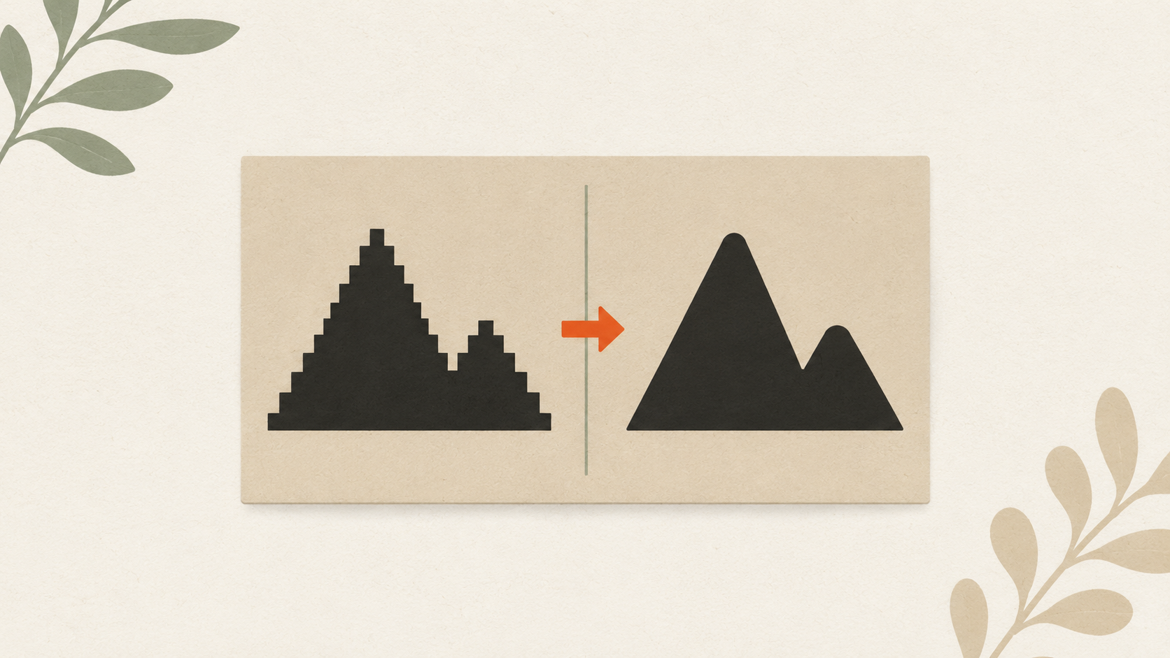
Step 6: Set realistic line weights
Screen printing can't reproduce arbitrarily thin lines. The practical minimums:
- Lines on light fabric: 0.5pt (0.18mm) minimum
- Lines on dark fabric (white on dark): 1pt (0.35mm) minimum
- Type: 6pt minimum for clean reproduction, 8pt for safety
- Negative space inside shapes (holes in letters like o, e): 1pt minimum
If your design has hairlines or tiny type below these minimums, the screen will either drop them entirely or produce broken/incomplete reproduction.
Fix by:
- Increasing stroke widths in vector software (Object → Path → Outline Stroke, then expand)
- Replacing tiny type with simpler larger versions
- Removing detail that won't reproduce
Step 7: Handle white ink and dark fabrics
If you're printing on dark fabric and any color in your design isn't dark itself, that color needs an underbase. An underbase is a white ink layer printed first to give other colors something to land on.
For your file:
- White on dark substrate prints as white ink (decide if it's meant to)
- Light colors on dark substrate need an underbase to print accurately
- Dark colors on dark substrate often print without underbase
- The shop's prepress usually handles underbase creation, but your file should clearly show which areas are light and which are dark
Tell the printer if your design will go on dark fabric. They'll set up underbase accordingly.
Step 8: Check your file before sending
Before emailing the file:
- [ ] Vector format (AI, EPS, vector PDF, or SVG)
- [ ] Colors separated by spot color or layer
- [ ] Text converted to paths
- [ ] Pantone numbers documented for brand-critical colors
- [ ] Line weights respect minimums
- [ ] File saved as a flat version (no embedded raster inside the vector)
- [ ] Filename clear (your business name + the date)
Open the file in Acrobat or another viewer and verify it looks right. Sometimes save errors mean the file you've got open in your editor isn't what's actually saved.
Common rejection reasons
File is raster, not vector. Most common rejection. Fix by converting to vector before sending.
Colors aren't separated. Each element appears to be a unique color combination. Fix by assigning spot color swatches.
Type isn't outlined. Sender's specific fonts not installed on prepress system. Fix by converting all type to paths.
Embedded raster inside vector. The "vector" file contains a JPG. Fix by replacing the embedded raster with a true vector trace.
Resolution insufficient for raster elements. Vector with embedded raster at low DPI. Same fix.
File too large to email. Use Dropbox, Google Drive, or WeTransfer.
Pantone colors not specified. Forces the shop to match colors visually instead of by number.
What to send with the file
Email to your screen printer:
- The prepared file (attached or linked)
- Final print size and placement notes
- Quantity needed
- Garment specs (fabric, color, weight)
- Pantone color references
- Any special requirements (ink type, finishing)
A complete first email accelerates quoting and production.
The takeaway
Screen printing rewards careful file preparation more than any other print method. Vector format, separated colors, outlined text, Pantone references, realistic line weights, awareness of fabric color. The work happens upfront — once your file meets these requirements, every screen printing order goes smoothly. Send a sloppy file and you'll pay in prepress fees, slower turnaround, and quality issues.
Stop redrawing customer logos by hand
ArtworkUpgrade vectorizes any logo or design in 30 seconds. Free preview before you pay. $7 per design, all formats included.
Try free preview →More guides for How-To Tutorials
How to clean up a low-resolution logo: a practical workflow
Step-by-step guide to salvaging a low-resolution logo: assess the damage, reduce compression artifacts, upscale carefully, and vectorize for the permanent fix.
How to prepare your logo for an embroidery order: a checklist
What to send your embroiderer to get the best result: vector file formats, size and placement specs, color references, and how to handle it when you don't have vector files.
How to convert a JPG logo to vector: 4 practical methods
Four real ways to get from JPG to vector: AI vectorization, manual tracing, hiring a designer, finding original files. Costs, time, and which method fits your job.